Data Visualization
Why Data Visualization?
An analyst can submit his/her analysis in an excel sheet, but the other person need not be an analyst or technically sound. If the analysis/data is represented in a pictorial or graphical form, human brain can process information easily. This is one of the key reasons, we use data visualization in order to understand the trend better and make better decisions.
What is Data Visualization?
Data visualization is the presentation of data in a pictorial or graphical format. Data Visualization allows us to quickly interpret the data and adjust different variables to see their effect. If the analytics presented visually, the decision-makers will grasp different concepts.
Eg: In an industry what are all the departments that need attention.
1. Visualize
Visualization plays an important role.
2. Analyse
3. Document insight
4. Transform data set
Matplotlib
Matplotlib is a python package used for 2D graphics. As usual I've used pip install to install the matplotlib.

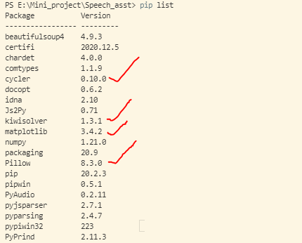
To verify if the matplotlib is installed or not, we can use 'pip list'.
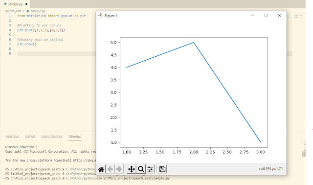
This is one of the simplest graph using matplotlib.
Types of Plots
1. Bar graph
2. Histograms
3. Scatter plot
4. Pie plot
5. Hexagonal Bin plot
6. Area plot
Reference:
https://www.youtube.com/watch?v=yZTBMMdPOww
Comments
Post a Comment